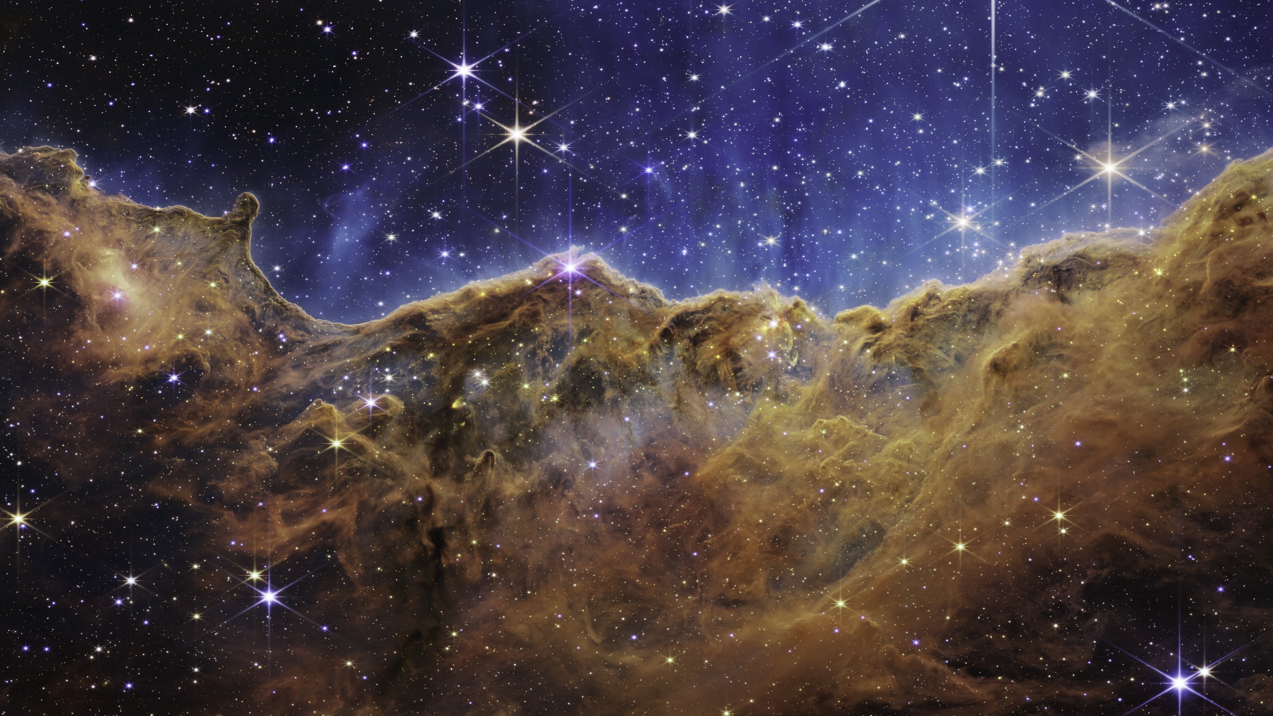
James Webb Space Telescope images are bursting with color: deep blues, glowing oranges, streaks of red and gold. It’s natural to wonder if any of that is real, or if someone just added color in an editing program. The honest answer is a little of both, and once you know how infrared light works, it makes complete sense.
The Basics
Are the colors in JWST images real?
JWST doesn’t take pictures the way your phone does. A phone camera captures red, green, and blue light all at once and combines them into a color photo automatically. Webb’s cameras work differently. They take a series of black-and-white images, each one through a different filter that only lets through a narrow slice of light.
Most of those filters are tuned to infrared light, the kind of light our eyes can’t see at all. So there’s no such thing as a “true color” version of these images sitting around waiting to be revealed. Infrared light simply doesn’t have a color the way sunlight does. Scientists have to choose colors to represent it, or we’d never be able to see what Webb sees.
How It Works
How do scientists choose which color goes where?
The most common approach is called chromatic order, and it’s simpler than it sounds. Each black-and-white image came from a filter tuned to a specific wavelength of light. Scientists assign blue to the shortest wavelength filter, red to the longest, and colors in between to the wavelengths in between, the same order they appear in a rainbow. Then all the separate black-and-white images get layered together like colored slides stacked on top of each other, and the result is one full-color picture.
This matters because the color choices aren’t random. Bluer light in a Webb image really does mean shorter, more energetic wavelengths, and redder light really does mean longer wavelengths, often coming from cooler gas or thick dust. The colors are a stand-in for real physical differences in the light itself.
Why It Matters
Why not just leave the images black and white?
Without color, all those separate filter images would look like a wall of similar-looking gray fog. Human eyes are very good at picking out small differences in color, but not so good at picking out small differences in shades of gray. By giving each wavelength its own color, scientists turn subtle differences in the data into something anyone can look at and instantly understand, no training required.
What The Colors Mean
What do the colors actually tell us?
Once you know the basic pattern, JWST images start to read almost like a map:
- Blue and white usually mark shorter-wavelength light, which tends to come from hotter gas or the most energetic activity in the scene.
- Red and orange usually mark longer-wavelength light, often coming from cooler gas or thick clouds of dust.
- A single standout color sometimes highlights one specific element or molecule, like hydrogen, that scientists are especially interested in studying.
Real-World Example
A real example: the Southern Ring Nebula
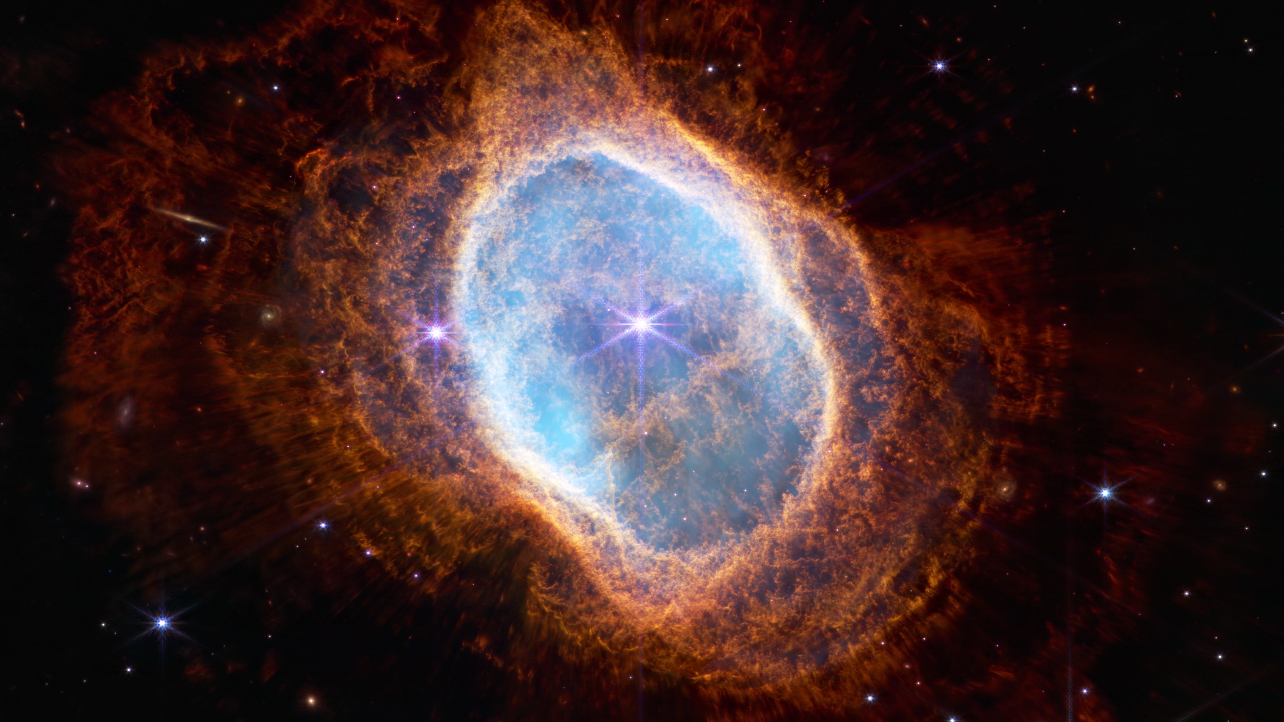
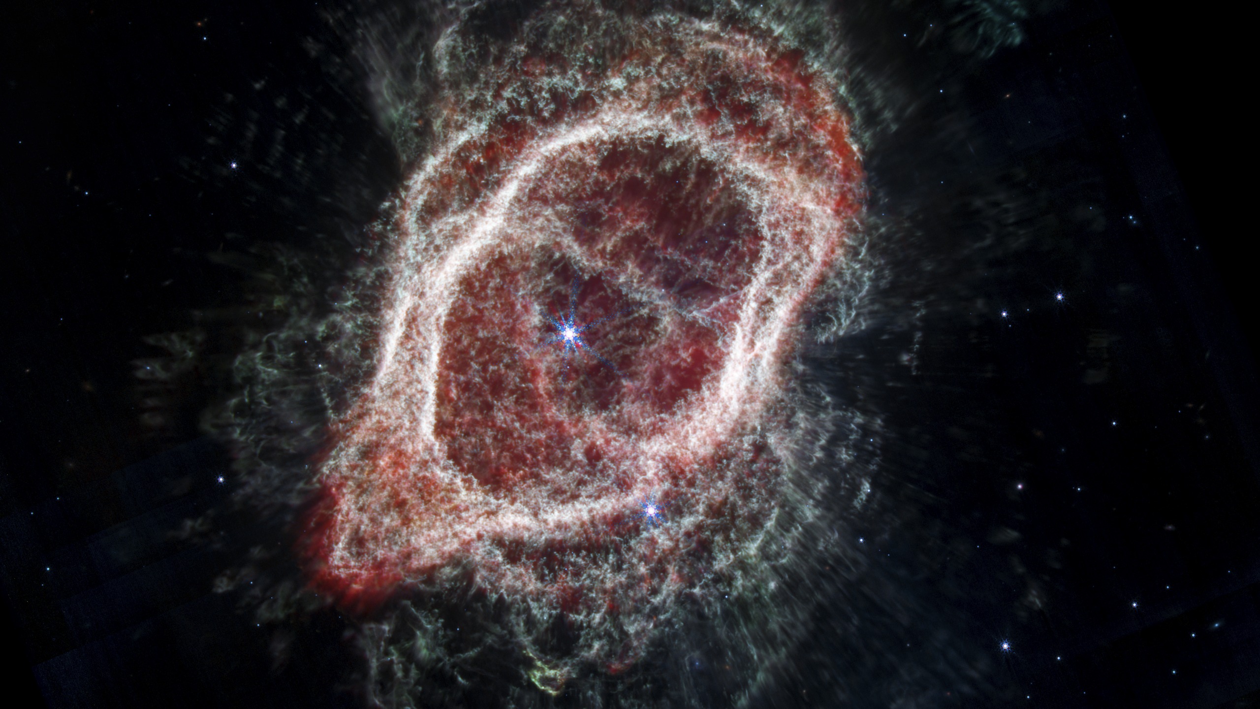
The comparison above shows the same object, the Southern Ring Nebula, imaged twice by Webb using two different infrared cameras. The star at its center is dying, and over thousands of years it has thrown off layer after layer of gas and dust. The near-infrared image picks out the hottest, most recently ejected gas glowing blue at the center. The mid-infrared image instead picks out the cooler, older dust and gas spread further out, which is why it looks like a completely different object even though it’s the exact same nebula.
Neither image is more real than the other. They’re two honest views of the same scene, just tuned to catch different parts of the story.
Want to try making these color choices yourself? Colorize a real JWST image and see how different colors change the way a photo feels.
If any of these catch your eye, every image on CosmicRift is free to download, already sized for your phone, tablet, or desktop. Browse the full gallery to find more.